Year 11 exam paper 2024


The theme I will be choosing to work on for my exam is places and spaces. I have decided to choose this theme because I believe I am really good at taking these pictures and I enjoy taking these type of pictures. Throughout all the work I have been doing mostly all pictures are to do with environment and outside places such as nature, buildings and the sky. Therefore, I want to continue taking these type of pictures as it suits me very well. For this component, I will achieve to take high quality photos and try my best for each piece of work I do. I will also take risks and experiment with my pictures.
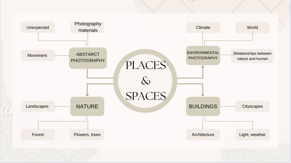
This is my mind map on what type of photographs I can take related to my theme.
Nicholas Gooden-Artist Research


Nicholas Gooden is a professional urban photographer and a cinemagraph artist. He takes photographs of the streets because he loves to wander around London and observe people and the environment around him. He takes photos of little moments which are unpredicted and captures them instantly. He never studied photography, he only started taking photos around 2008, and then launched his own website in 2010, and then in 2014 his own limited company. His specialities are cinemagraphs and time-lapse Gooden loves to experiment and learn new things. Brands such as Amazon, Adidas etc hire him to produce social media content. Gooden uses a combination of various cameras, however he prefers to use mirrorless cameras which allows him to carry around less weight on his long shooting days. He prefers to avoid interacted with people, meaning he takes pictures of them while they are unaware to capture the 'real' them. Gooden wanted to be a photographer to become a better, happier person and didn't look up to any photographer and still doesn't till this day. Gooden uses photoshop to edit his photos, however, over the years he has looked over his work and has said to himself that using less editing is better because then you could just take a better photo the first time. In my opinion, I agree with him because if you don't like the image you can always retake it and refine it or just take it perfect the first time you take it. Another option is taking a few pictures of whatever you are photographing and then choose the one you love most.

I chose to evaluate this image because I like the reflection it is showing on the water. In this image, Gooden enhances the beauty of the area and captured a beautiful image. The colour in the images are bright and I love images with a sunset or nice colours in the image. The image looks amazing with the shadows, reflection, colours and the clouds blend in with the images beautifully. I believe, I am quite well in taking photos like these so I think I can relate more with his work.
Homework


Inspired by Nicholas Gooden I took images of places and spaces. I think they are very good images and using these images I will experiment. I took these images when I was travelling in the holidays. I am now going to use these photos to do different experiments. Some of Nicholas Gooden's pictures are in black and white, so I may use some of my pictures and turn them into black and white and then use them to experiment. Gooden uses photoshop to edit his photos so now I will experiment using online apps to edit my photos to make them look a bit different.
Experiment 1


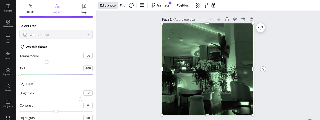
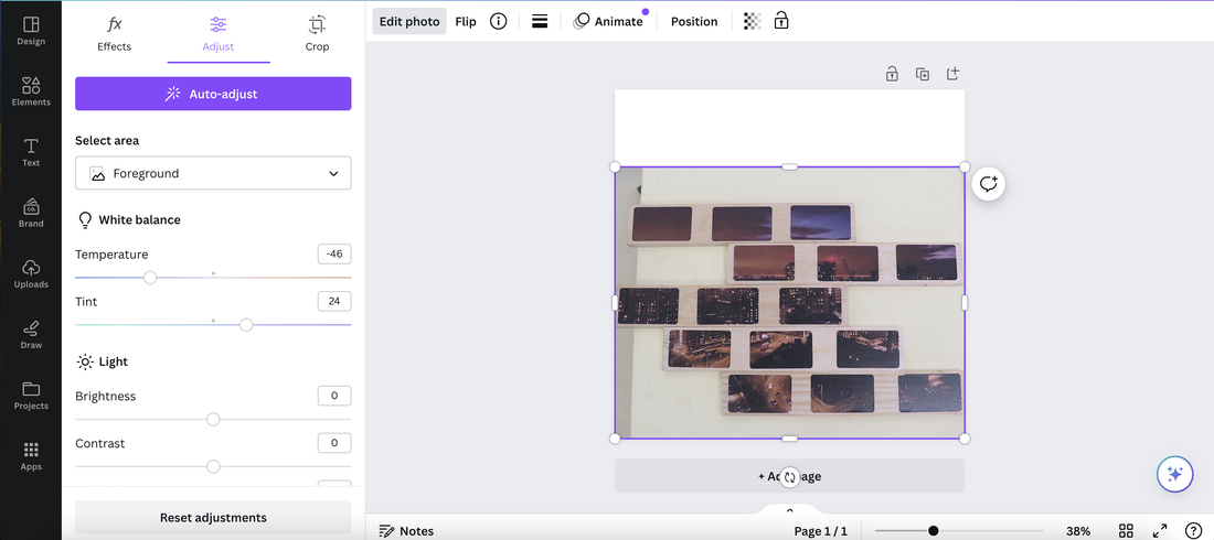
Using the image on the left I edited the photo using canva. I tried with one image first to see what it would look like. I changed the tint, temperature, brightness, and, contrast. It looks bright and coloured, so now I am going to try something else using the same image. I believe it looks really good to be honest. Therefore, I am going to experiment something similar to this.
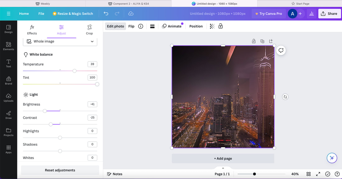
This is a screenshot of what I did for the images.
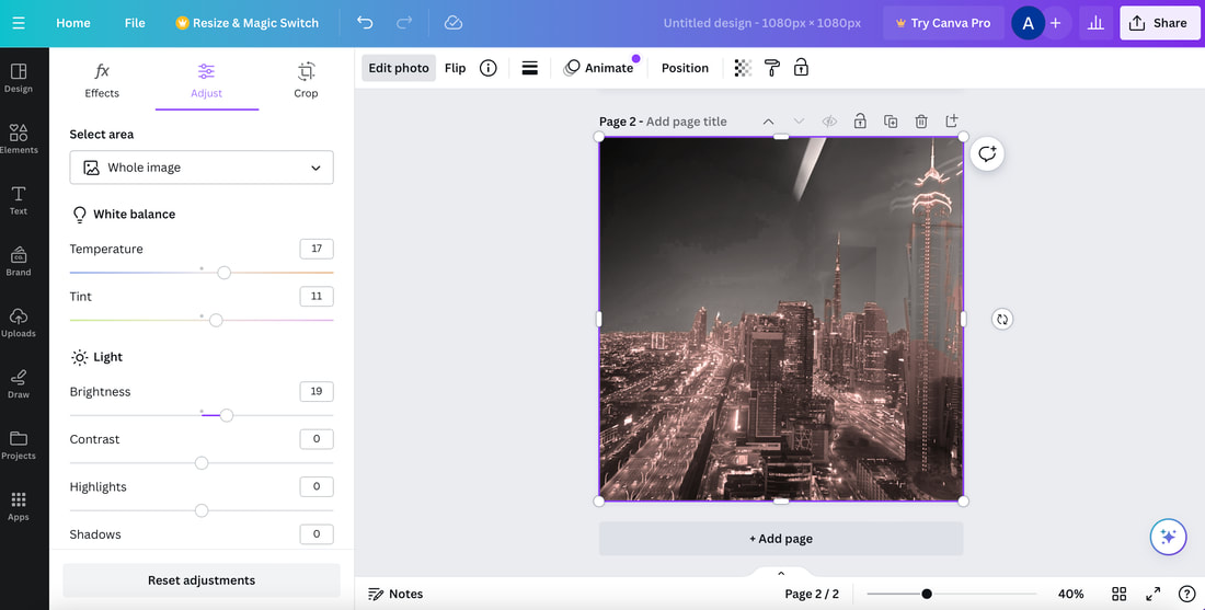
Now, because I have experimented with the original image, I am now going to change the original image to black and white and then use Canva to edit the image.
Experiment 2


Using the black and white image I changed the foreground of the image. I think it looks good with the black and white image and the original one. I kept the background black and white and changed the foreground into a bright colour, now you can see a contrast between black white and colour.
Now I am going to use the experiments I did and make diptych's.
Experiment 3


Using my four images, I made two diptych's. This shows a contrast between the colours and it looks really good. The first diptych I use the original image and an edited one, then the second diptych is black and white image then a that image edited.
Homework


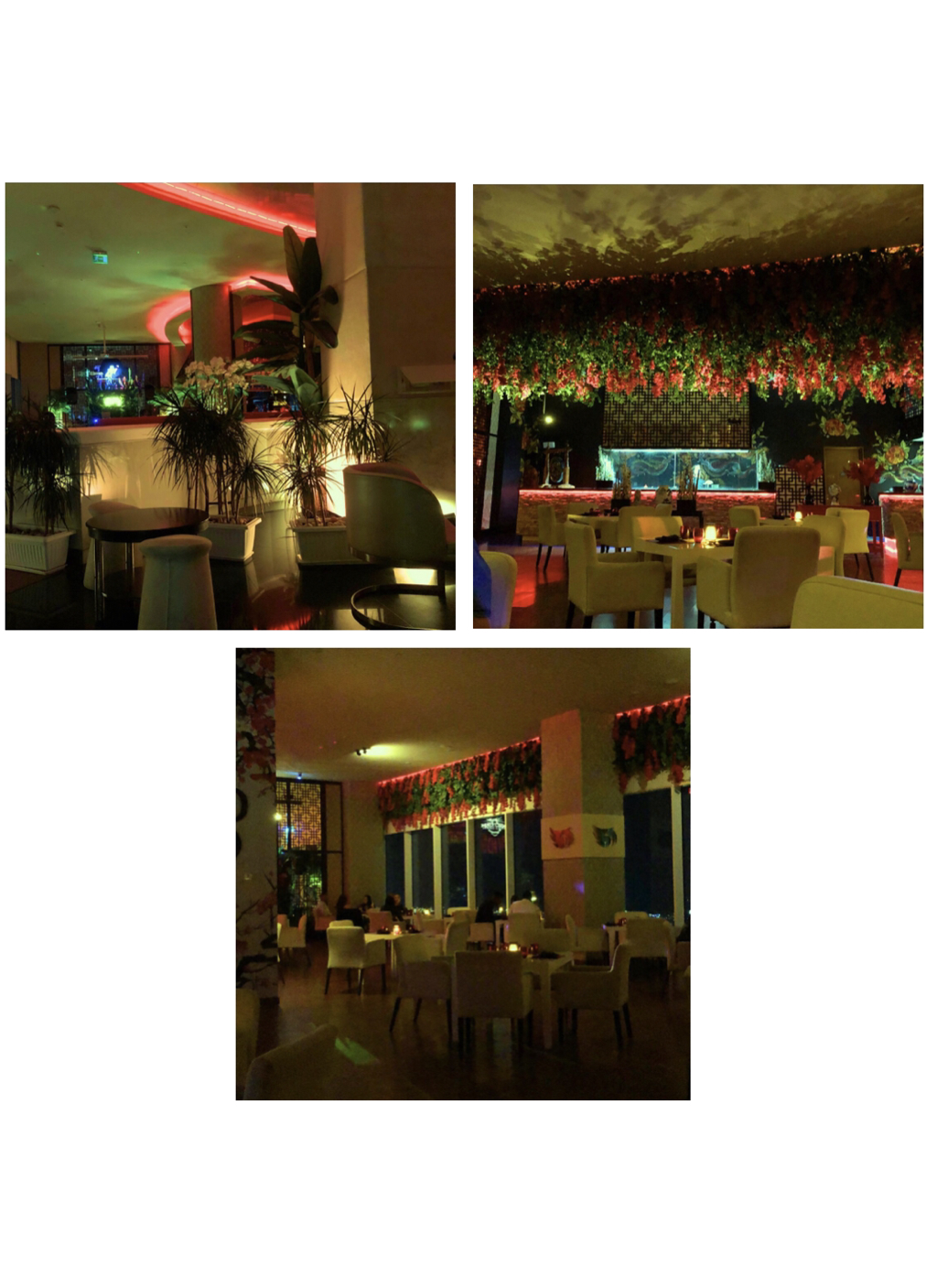
We got set a task to take 30 photos. I took more photos, I really love them, some I can improve however, I will use some of these to experiment with. Some of the photos are similar but I have a variety to choose from to experiment with.
Experiment 4


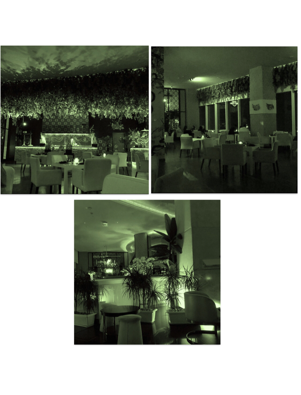
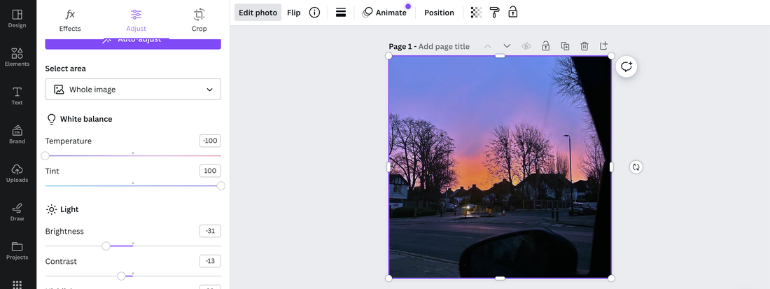
I used these images and edited them with canva. I changed the tint to -100, brightness to 58, and vibrance to 66. I used these images because I took them in the same area but from different places within the area. Now using these I am going to make a diptych with all three of them.


Experiment 5
I made a diptych using the three similar photos I edited on canva. I was going to put all three of them together in a line but I put it as this format because then you can clearly see all three images. I am now going to do the same thing but make the images black and white and then make another diptych of the black and white images one.
Experiment 6


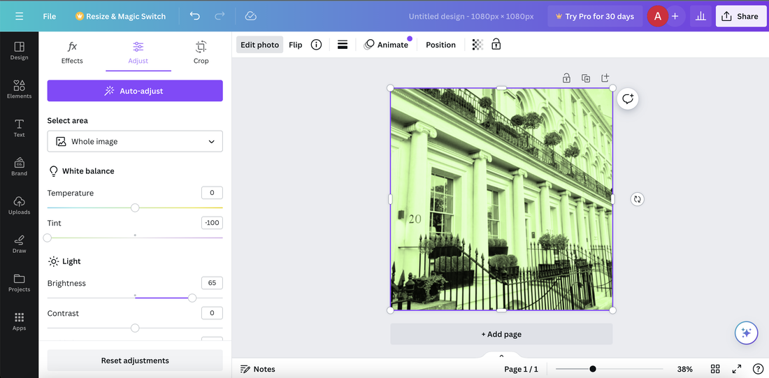
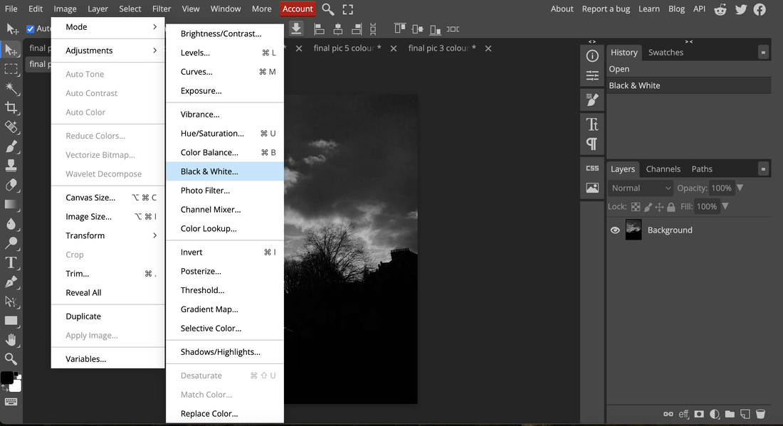
I used photopea to turn the images into black and white.
This is a screenshot of what website I used and how I did it. First, I experimented then below is the final piece and editing process.


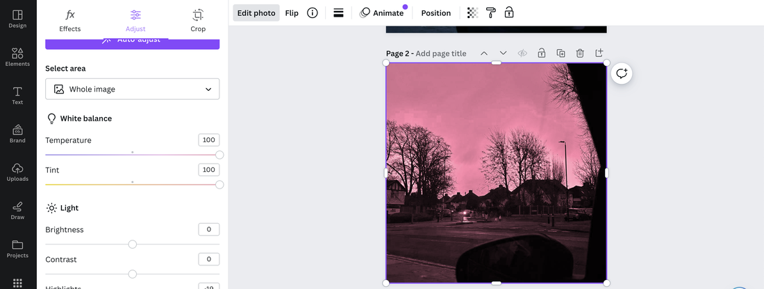
Using the black and white images I edited the photo the same as I did for the original images. So I changed the tint to -100, brightness to 58, and vibrance to 66. And this was the end result. The picture looks gloomy but it looks nice. I am now going to make a diptych with these images.
This is a screenshot of what I did to make the image a gloomy effect.
Experiment 6
Here is the diptych with the three black and white images. Now I will make a diptych for each image with the colour edited one and the black and white edit one.
Experiment 7


I have made diptych's with the coloured edited images and the black and white edited images. They look good. I am now going to use other photos and try something else.
Experiment 8


For this image, I edited the foreground by changing the temperature to 100, tint to 100, brightness to 27, vibrance to 47.


Using these three images I used canva and changed the colour of the whole image. I then used the original image and turned the images into black and white to do another experiment.


Using these three images I turned them into black and white then edited them using canva and then i changed the tint and temperature. With black and white the pictures look mysterious and gloomy, so now I can see 3 different types of my images. One as the original one, second one as canva edit and then the third one as black and white edited.
This is a screenshot of what I did.
Groups-Ira Garber


Ira Garber is a commercial photographer. He takes still life photography and studied photography at the Rhode Island School of design. Ira Garber uses pastel and muted everyday items, he does this so that he can create vibrant palettes within his images. These are then used/shown in magazines and advertisements. Ira Garber uses different objects and groups them and takes the photos. The photos I chose to evaluate of Ira Garber, he uses pastel colours which look really good. His images are very subtle and elegant, I think that is also another reason his images are very good. He uses different objects however, although he is using different objects they look amazing as they are placed in a group, therefore, the image looks very exquisite.

I really like this image because it has different textures and patterns of the teabags. Garber uses a small depth of field to capture the tea bags rather then the background itself. The main focus of this image is the teabags, and Garber uses studio lights to make his pictures stand out more. He has done this with this image and has put the central focus of the teabags. The patterns and textures on the teabags makes the image look different to the rest because it looks more fascinating to look at, so this makes the picture look more effective. The composition of the tea bags are lined up in a straight line as neat and perfect as possible which makes the image look elegant. Therefore, I really love this image.
Homework


I took 30 photos in response to Ira Garber. I believe my pictures turned put well however I didn't quite get the colours and objects right that Garber uses. He uses more pastel colours and mine are mixed it's colourful, dark and bright. So, in a way I still have taken still life photos however, I think I could improve and think harder as to what I should change about the pictures and what different objects I should use. As I got nearer to the end of taking 30 photos I kind of struggled finding objects and ideas of what I should photograph, so that was an issue during the process of taking photos. Overall, I think it was a bit difficult but I still managed to take 30 photos of still life photos, however, I need to focus on the colours and objects more. I could do this by using photoshop/photopea/canva to change the colours of the whole image, I may be able to do this and then further work by experimenting more.
Experiment 10

I made a sculpture using wood pieces and one of my images which I printed on to sticky labels. I used 4 pieces of wood and made spaces between so it can space out. I believe it looks really well, I will now experiment with different pictures then look into my next experiment.

I made another sculpture using a different photo and this time I used 5 wood pieces and a bit bigger ones in terms of length and then I left spaces in between the stickers and the wood pieces. I am going to do more with different images as a new experiment.
Experiment 11


After changing the colour on canva, I edited the picture using photopea and i filtered it with 'oil paint'.
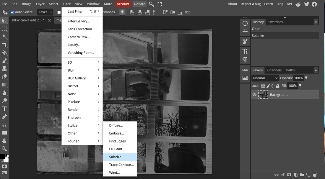
I turned the image into black and white then edited it using photopea and filtered it with 'solarize'. I did these just to experiment on what it would look like. I didn't really like it therefore didn't do any further experimentation with this.
Experiment 12


I took images in the studio of my block pieces. I am now going to rearrange them in to a different form.


I moved around the images and took photographs of them. I think they look good because then you see them in a new form.


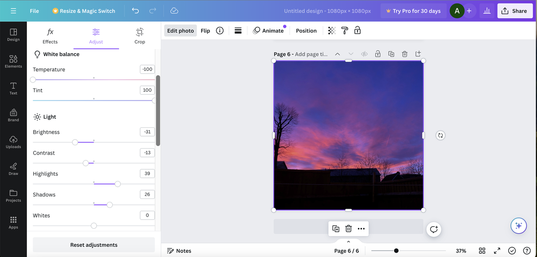
I used canva to edit the pictures I took in the studio. I changed them up a bit by changing the temperature to -48, the tint to -72, brightness to -26, sharpness to 36 and vignette to -18. They look good because they are in different forms.
Experiment 13


Using these 4 images I took, I am now going to experiment with these.


Using canva I edited these photos and now the colour of the images look similar.
This is a screenshot of my process for my coloured photos.


I turned the photos in to black and white and then edited them using canva.
This is a screenshot of my process for the black and white one.


Using my experiments I made a paper pamphlet book. It is double sided and I have put the colour image that I edited opposite the black and white image I edited.
PROCESS STEPS:
➡️Chose 4 images.
➡️Edited the images on canva.
➡️Use the original image and put it into black and white.
➡️Use canva and edit the black and white image.
➡️Printed the images on A4 paper with two images on one page to make it A5.
➡️Use the guillotine paper cutter and make sure there is no white on the picture.
➡️Use A3 white paper and fold the paper in half vertically and horizontally to make 4 portions.
➡️Glue the images on opposite each other, on both sides of the paper.
➡️Glue the paper together so it doesn’t open up.
➡️Then make sure it folds up and looks like a pamphlet booklet.
➡️Take pictures of the final piece in the end.
Experiment 14

The images I used for the experiments before this I used the same images to make a collage. I used a cut out of barbed wire and placed it on top of my two images. I am now going to use the same photos and make more collages.


I did two more, and they look pretty nice, therefore, I might look into this more and develop my ideas and do something like this for my final project.
Final piece preparation
MATERIAL NEEDED:
-Glue
-Scissors
-Tape
-Black card A3
-White A3 paper
-My pictures
-Print out of barbed wire
PLAN:
For my final piece I am going to make a book/pamphlet. I am going to use my images and cut them to the right size so they fit in with the page and then I am going to glue them and make a big piece and then refine it if needed.
Another thing for my final piece I am going to use my photos and use the black and white and the colour one of the images and then cut them 2cm apart and then rearrange it with one black and white one and then one colour and then I am going to glue it onto white A3 and trim the other parts. I am then going to cut out the barbed wire and place it on top and get rid of the excess. I am then going to do it with more images.


I am going to use these images for my final piece.


Using canva I edited my images so I am able to use them in my final piece. I will see if I can use all of them however I will try my best to make something good.
This is a screenshot of what I did. I did this for every image so I screenshotted just one of the pictures.


These are the black and white images edited.
This is a screenshot of what I did for each image. I used photopea to turn them into black and white.
